Andele Mandele runs one of Latvia's most-used marketplaces — a place where hundreds of thousands of items move between people every year, mostly on phones, mostly with small payments. Platforms like this don't compete on features. They compete on reliability, clarity, and the small frictions that compound over millions of sessions.
When Andele Mandele brought us in, the brief was not a rebuild. The platform works. The audience knows it. The business runs on it. What it needed was a surgical pass — sharpening the user interface where it mattered, modernising the payment infrastructure, and lifting reliability across the routes that carry the most traffic. Refinement, not reinvention.
That distinction shaped every decision in the project.
The Brief — Improve Without Disrupting
Platforms with established audiences have a specific risk profile: the worst thing you can do is "improve" them in ways that confuse the people who already know how to use them. A familiar layout that takes a user three seconds to scan is more valuable than a "better" layout that takes ten seconds to relearn. Andele Mandele understood this — and they wanted a partner who did too.
The scope was clear:
- Refine the UI across desktop and mobile, preserving brand and structure.
- Streamline the payment flow — fewer steps, more reliable handling, clearer confirmation.
- Improve reliability across the routes that affect the most users.
- Touch nothing that didn't need touching.
What We Refined on the Frontend
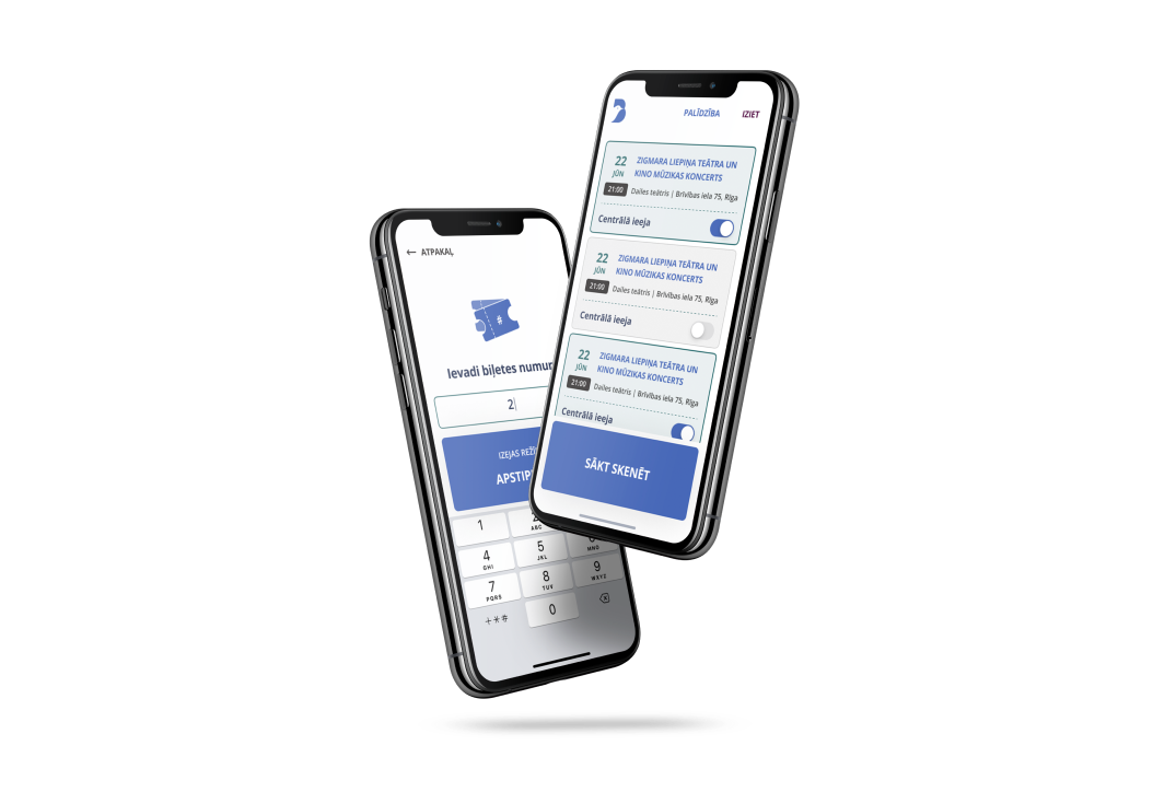
The UI work focused on the surfaces users actually live in: category browsing, item listings, and the storefront flow. Layout conventions were preserved — the recognisable Andele Mandele card grid, the filter sidebar on desktop, the bottom navigation on mobile, the discount badges that signal a good buy at a glance.
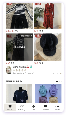
The mobile listing view — clean card layout, prominent pricing, and discount badges that scan in under a second.
What changed was the polish. Spacing tightened where dense screens felt cramped. Touch targets sized up on mobile. Information hierarchy sharpened so the eye lands on price, condition, and "applications" in that order, every time.
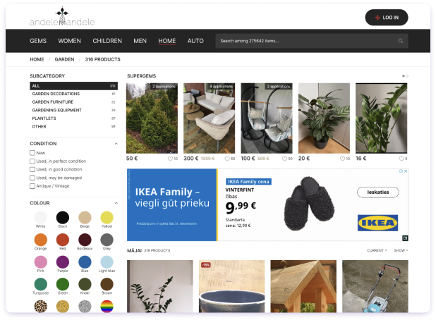
Desktop category browsing — filters retained their location and behaviour; visual styling refined for clarity at scale across 275,000+ listings.
Across desktop, filter sidebars and search were kept where users expected them. Subcategory navigation, condition filters, colour pickers — all in their familiar positions, all visually tightened.
The Payment System — Where Marketplaces Live or Die
The payment work was the half of the project that didn't show up in screenshots. It also mattered the most.
Marketplace payments are not e-commerce payments. They have to handle small transactions at high frequency, route money between sellers and buyers, manage edge cases that don't exist on traditional storefronts, and never lose state when something goes wrong. We modernised the payment infrastructure to make all of that more reliable: clearer flow for the user, hardened error handling underneath, and a tighter feedback loop between transaction and confirmation.
The user-visible change is modest — checkout feels faster and clearer. The structural change underneath is the part that compounds: fewer failed transactions, fewer support tickets, more trust in the platform.
Content + Discovery — The Editorial Layer
Andele Mandele isn't only a marketplace. It also runs an editorial layer — articles, guides, and seasonal content that drive discovery beyond search. We refined that surface alongside the storefront: clearer article cards, better hierarchy on the blog index, more legible mobile reading.
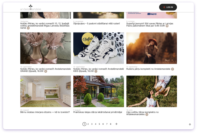
The editorial index — article cards arranged for scannability, dates and categories surfaced consistently.
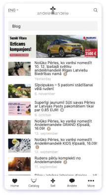
Mobile editorial — same content density, optimised for thumb navigation.
Content is what brings people back when they're not actively shopping. Treating it as a first-class surface, not an afterthought, matters more than most platforms realise.
What Stayed the Same
Most of the platform. That was the point. The brand, the colour palette, the layout grid, the navigation patterns — all preserved. Users opening the platform the day after deployment saw the same Andele Mandele they'd been using for years, just sharper around the edges and more reliable underneath.
This kind of work is the opposite of a showcase rebuild. Nobody writes blog posts about it on Twitter. But it's often the highest-leverage thing a development partner can do for a mature platform: lift the floor without changing the room.
The Codnity Dev Approach
We don't always rebuild. Sometimes the right move is to refine an existing platform — to add value inside the system that's already serving users, rather than replace it with something they have to relearn. For Andele Mandele, that meant treating UI work and payment infrastructure improvements as two halves of the same brief: sharper on the surface, stronger underneath, with the brand and structure intact.
If you're running a platform that works but feels overdue for a careful pass — sharper UX, more reliable payments, cleaner mobile experience — we're happy to talk. The most useful conversations usually start with what NOT to change.
Frequently asked questions
What was the scope of the project?
Did this involve a full platform rebuild?
Why payment infrastructure improvements?
How was the brand identity preserved?
What does this say about Codnity Dev's approach?
Published · Updated · Last reviewed
Reviewed by Ģirts Lediņš, Codnity Dev MD · 20+ years software engineering